REVIEW
HyperFont
Michtron
576 South Telegraph
Pontiac, MI 48053
(313) 334-5700
$49.95, Color or monochrome
Reviewed by Ian Chadwick
HyperFont is the first attempt to escape from the wearisome world of bit-mapped fonts by offering a designer and editor to create vector fonts from which GEM fonts can be generated at the required sizes, at any resolution from 50 by 50 to 999 by 999 DPI, from six to 999 points. While no programs (currently) use Hyperfont's vector output (programs like DynaCADD and Calamus use their own vector fonts and commercial Compugraphic fonts), any GDOS application can use the bit-mapped fonts created by HyperFont.
The immediate advantage of HyperFont is that, once created, a single vector font can be used to generate endless numbers of pixel fonts from the same template by simply specifying new resolutions and sizes. These generations are far truer to the original than those fonts built by algorithms, which manipulate existing pixel fonts into the desired point size.
Working like a mini-CADD program, Hyperfont's tools are far more suited to font design than the pixel-based font editors, with real circles and curves, rather than approximations of them. Unfortunately, the tools are not sufficient for the job intended, and the 56-page manual (including five blank pages) is wholly inadequate—a Michtron trademark.
First and foremost, there is no Undo function. If you make a mistake—move a line by accident, bend a curve the wrong way, rotate something incorrectly—you have to restore it manually, if possible. Pressing Undo only sends you to character zero. Although the manual fails to tell you, pressing any key or key combination displays the character associated with that key; it doesn't perform the function you might expect of it. So Delete, Help, Clr/Home and so on don't act as intended—or as needed!
Since there are already two character-selection features—one on the icon pad, the other in the Edit menu—this keyboard selection method is overkill. However, although the current character is highlighted in the selection manu, there is no way to tell which characters have been done, or even how many have been done. And there are no character numbers present with the character display for reference.
There is no indication of the size of the font in terms of relative points on the drawing area. There is no display of X and Y coordinates to guide you, so absolute positioning of lines is impossible. There is a square of solid lines, which one assumes represents character borders. You can, however, draw outside it with impunity, although you can't generate a font beyond the border. You cannot change the size of this boundary square, although it only occupies about 20% of the full drawing area.
Although there is a grid display, there is no snap-to-grid to aid drawing. This is awkward, since unconnected lines produce bizarre effects in the "show character" display box. It's not mentioned in the manual (like so much else), but you quickly learn that if endpoints of lines are unconnected, problems result. The maximum grid size is 20 by 20, far too coarse for detailed work.
There is a "pliers" tool, described in the manual as:
"The (dis) connecting tool: You can connect adjacent lines with this tool. This way the shape will run smoothly from one line to another, and dragging one line will move the other. Again, it's much easier to try things than to describe them. It's a good idea to study the demofonts for the effects of connecting and disconnecting lines."
This gives you a good idea of the problems associated with the manual and the capacity of the instructions. That's all you get for this tool, a suggestion to experiment with the demofonts (sic.). No explanation of how the tool operates. I was unable to make or do anything constructive.
Another example comes from the same page, in the description of the pointer:
"Double-click on any endpoint with this tool to display a pop-up menu with several options, which will be described later."
Needless to say, these options aren't described anywhere, later or earlier. The pointer is one of the most important tools; it performs several tasks, including bending lines into Bezier curves. What's a Bezier curve? The manual doesn't tell you that, either.
The pointer is also used to stretch and shrink a line, but because it wants to create curves all the time, it requires use of the "straight-line" tool to correct it.
The manual also neglects to mention that the "magnify" tool also produces a pop-up menu when you double-click (options of which, again, remain undocumented).
The manual briefly mentions "six moveable lines," vaguely described as the "half line," "top, descender and bottom line," the "kerning information line" and the two "dotted vertical lines," which "specify the current character width in proportional fonts." That's seven lines by my count. They don't use standard typographic terminology, but you can guess at the intent. It appears from the screen that one line is missing. Since there are no labeled pictures, it's hard to figure which one, but I assume it's the "half line," better known as the "x-line" or "x-height line." No relevant information is given as to how to use the lines, what they're for or why. Worse, each line must be set individually in each character (like the grid), an impossible task without some form of snap or X-Y information.
As for the important concepts of kerning and proportional fonts, forget it. Like so much else, you're left in the dark.
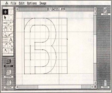
The "demofonts" provided are all incomplete in some way; none provides a full 256-character set. SWISS1 is the best, with all the ASCII letters, numbers and punctuation except the ("@") sign available. It's also the most primitive and least interesting of the lot. The other two sets are in considerably worse states of incompletion, missing many ASCII characters. The supply of demo material is far from generous and nowhere near instructive.
The CUT command in the Edit menu doesn't cut, it copies. And the manual doesn't tell you that if you hold Shift while selecting lines with the pointer tool, you can select more than one line.
The "sizer" tool is another bizarre item. The two lines of explanation fail to demystify its effect. Ninety-nine percent of the time it erases my carefully constructed character, leaving me with a single dot. The effect, of course, can't be undone.
Despite the manual's assurance that the lasso tool can be used to "capture character parts," it only captures whole lines within its boundaries, not parts thereof.
Rotate and Slant are graphic: They don't provide any textual indication of the angle, so there's no precision involved. Since you also can't rotate or slant an entire character set at once, it means guesstimating the degree for each character and hoping you're correct. Good luck.
Rotate, Slant and Mirror, like everything else, are permanent and can't be undone.
You can load a GEM .IMG file and use a part of it as a background to trace a character over. This is useful to a certain degree when using, say, scanned images of characters as templates for your own. But if you change characters, the background image is lost and must be recopied back to the character each time—a real pain, since there is no way to reposition the background once you've copied it over to the character editor. There are no sample images for you to experiment with, either. It would have been better had they also allowed users to load Neochrome and DEGAS format files, since these two are probably the most popular graphic file formats around.
Every time I tried to generate a GEM file, I got a disk I/O error message (on my good hard disk), even when using the supplied "demofonts." Afterward, the "Now generating character:" box stayed on the screen, against my character (no proper redraw). It turned out that the program uses a default directory that didn't exist on my drive, called /FONTS. This cannot be changed in the dialog box, so I had to quit, create the folder, then reload HyperFont. So much for user-friendliness!
There are no tutorials or design tips. There is no technical information, discussion of error messages or description of the file formats. There isn't an adequate index. Neither are there suggestions for creating or editing fonts or even a bibliography of recommended texts. If you aren't intimately familiar with GDOS and the ASSIGN.SYS file, you'll find the description of how to install your GEM fonts into it far too vague and obfuscatory to be of real value.
The net result is a great idea minimally realized. It has some nice touches, a few good approaches and is a generally well-designed desktop. It is, however hamstrung by inadequate tools, no Undo feature, a bargain-basement manual and sloppy samples. Back to the drawing board, Michtron: Until these problems are corrected, it's not worth the time or the money.

Ian Chadwick is a Canadian freelance writer and editor whose hobbies include writing about, reading about the exploring the use and abuse of the English language. He is also an amateur paleontologist, naturalist and carpenter.