Third-Party Fonts Get An Eagle-Eye Evaluation
BY DAN FRUCHEY
Word Processing/Desktop Publishing Editor
Fonts are kind of the DNA of desktop publishing - they're the basic building blocks upon which to create a document. Without fonts, there is no text, and where would computer publishing be without text?
But unlike DNA, fonts can he copyrighted. Most DTP packages include a set of public-domain fonts so that you can get started on a document right away - usually the Swiss and Times Roman families (a family refers to variations of a font: italic, bold, light, etc.). DTP packages also often include fonts that companies develop themselves. Higher-level DTP gives you access to whole font families. ISD Marketing, for instance, has licensed literally hundreds of fonts from the Compugraphic family for their Calamus product.
Several third-party developers have created font packages for the Atari
desktop publisher. While all offer essentially the same thing -fonts -
the packages vary in quality and quantity. (Editor's Note: To help you
with the selection process the developers of the fonts reviewed here have
granted START permission to place samples on our monthly disk. From your
backup, double-click on FONT_ARC.PRG, choose Extract, then choose a destination
disk from the item selector that appears. You should then see the following
files:
CH_STEMS.CFN, EXPORT.CFN, SOUVMEDE.CFN, CHERRY.TXT, CHSTEMS.TXT, ISDFONTS.TXT,
SAFARI.TXT.)
Before we begin the actual comparison, let's take a quick look at some of the differences in font structure and then provide some pointers on how to select the right fonts for your particular needs.
Outline Fonts: The New
Standard
Although a few word-processing and DTP programs still use bit-mapped
fonts for printer output, their numbers are shrinking. Virtually every
DTP program released in the last three years uses outline fonts. The latest
word processors, Script and PKS Write, follow this trend and even Atari
Corp. has converted GDOS to use outline font formats.
The shift toward outline fonts makes sense. They consume less memory and disk space, they are more versatile than bit-mapped fonts and, in general, they are relatively inexpensive. An outline font can he easily rendered in different sizes, weights and styles from a single file. With the right software there is virtually no end to the manipulations you can Perform on an outline font.
There are literally hundreds of outline fonts available and, according to font developers, many new offerings will be published soon. Virtually any font available on a PC or Mac computer is available for the ST.
Perhaps the only problem for the DTP industry to solve now is determining which outline format will dominate the Atari market. Four formats are currently available for the ST: Calamus, PageStrearn, Ultrascript and Postscript. All are similar in nature, though none of them are compatible.
Font Selection
There are many factors you should consider when purchasing fonts. Questions
about price, format and availability only scratch the surface. To help
you make the best selections possible ask yourself the following questions:
Completeness: Does your font make use of the entire Atari character set or just the symbols available from the keyboard? Are there both uppercase and lowercase characters in the font? Can you access less commonly used characters such as a copyright symbol or bullet?
Clarity: Are characters easy to recognize or are they difficult to identify? Does the character style slow reading? Is the character style distinct enough to be read at arms length or do you need to hold the page close to your face to decipher text?
Uniformity: Do letter curves flow smoothly and evenly or do they appear irregular? Do character strokes line up correctly with other components or do the letters appear unbalanced? Does each character appear evenly designed, consistent with the entire font and similar characters in the set? Compared to other characters in the font set do some letters appear too hold or too thin?
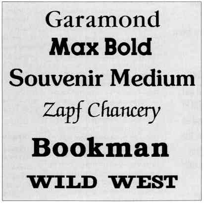
Shown here are some of
the font samples
included on your START
disk.
Size: What is the smallest point size you will be using with this font? Are the characters clearly distinguishable in that size? Are portions of letters missing in small sizes (character drop-out)? When you enlarge the letters are there noticeable flaws in design?
Versatility: Can the font be used on a daily basis or is it a specialty design that has limited application? If it is a font you plan on using in the body of your documents are there bold, italic and bold-italic variations available? If you change the font to bold, skewed, or any other style is the font still usable? Does the font set include stylistic variations of an individual character that help give the font a unique flavor.
All three font publishers reviewed here stood up to these tests remarkably well. Any apparent flaws found in the character sets were a matter of design or interpretation, not omission. In many instances the designer had excelled, adding additional touches that made a font more usable than a nearly identical version offered by a competitor.
The Fonts
It's a little difficult to prepare an individual review of each font
offered. ISD Marketing alone offers hundreds of fonts and a recent acquisition
doubles the size of their font library. To give you the best assessment
possible I'm providing an overview of the quality of fonts each manufacturer
markets, not individual reviews. I've also included comments on distinctive
features that mark the brands, and recommendations on some body and display
fonts I found particularly pleasing.
Cherry Fonts
This British Columbia-based company takes a practical approach to font
development. They place a strong emphasis on classic styles which have
wide appeal and meet the needs of most users. Renditions of classic fonts
such as Times Roman and Garamond contain all the detail and subtlety found
in the more expensive fonts available from ISD Marketing. Characters are
well balanced and easy to read. Font sets support extended European characters,
symbols and bullets, along with a few distinctive dingbats no other fonts
possess.
Cherry Fonts currently sells five different font packs which each contain at least four full fonts (Some font packs contain more). While their current selection is limited, Cherry's Todd Johnson tells me there are many more font packs currently under production. I look forward to their release with the glee that only a font junkie can muster. Cherry Fonts are only produced in Calamus' font format. Unlike the fonts available from ISD Marketing, these fonts can he converted for use in PageStream and other programs via MegaType's Fontverter.
I highly recommend their Times Roman (FontPak #4) as an alternative to the version packaged with Calamus, which is improperly sized and lacks bold and true italic versions. For a distinctive font for body text and titles try Cherry Garamond (FontPak #2). Examples of Cherry Fonts are in the file CHSTEMS.CFN.
Computer Safari
Jay Pierstorff, designer of many popular fonts sold under the SoftLogik
label, now offers collections of fonts through his own Atari dealership,
Computer Safari. Safari specializes in display fonts useful for headlines,
titles and captions. The collection includes an impressive array of distinctive
fonts. Several body fonts are also available though not all of the standard
variations are included (i.e., hold, italic, hold-italic).
The only drawback with Safari Fonts is the occasional absence of a lowercase alphabet in a character set intended for display use (14-point or greater). While you may not even need the lowercase characters in a title, they're simply not available and typing them on screen produces no visible result. When I imported text using one of these fonts, it appeared as if entire portions of words were missing. Knowing the reason for the lettering gaps I was able to change to uppercase letters or switch fonts. Still, something should be defined in the key positions for lowercase letters, if only to let you know what's happening.
Three fonts are included in each Safari pack. Outside of their versatility, perhaps one of their greatest selling points is their compatibility. Each pack includes versions of the fonts that will work with Calamus, PageStream and Postscript. Why spend time converting fonts when you don't need to? When running tests to compare publishing programs I produce identical pages with each product using fonts from the Safari collection. This allows me a greater number of parallel options and, when it's necessary to switch programs while producing a single document, no one is able to notice a difference in output. There isn't any.
I especially recommend Computer Safari's Bookman (font pack #5) for
body text and Micrographic (font pack #4) for sonic interesting titling
effects. Examples of Safari Fonts are in the file EXPORT.CFN.
|
Cherry Fonts, FontPaks 1-5: $42.95 each (U.S.); $49.95 each (Canada; B.C. residents add 6 percent sales tax); add $2 S/H. Cherry Fonts, 2250 Tyner St., Unit 4, Port Coquitlam, British Columbia V3C 2Z1 (604) 944-2923 Font Packs, $29.95 each (call for selection). Computer Safari, 606 W. Cross St., Woodland, CA 95695 (916) 666-1813 Fonts, call for price and availability. ISD Marketing Inc., 2651 John St., Unit 3, Markham, Ontario L3R 2W5 (416) 479-1880 |
ISD Marketing
The distributors of Calamus and Calamus Outline also sell commercial
fonts for their programs. These fonts have been purchased from the Compugraphic,
Linotype and URW libraries.
To put it bluntly, these are the finest fonts currently available for
the ST. You can choose from a wide
range of styles using the most popular display and body-text designs.
Can't find the font you want? For a fee ISD will convert any existing Compugraphic
font for use with Calamus. I'm unaware of any other company that offers
such a policy. All font sets are complete, including the extended European
character set and a standard selection of symbols and bullets.
While ISD's fonts are the best, there are also several drawbacks that accompany your purchase. Fonts are only available to registered! Calamus/Outline owners and each one is "locked" for exclusive use with a specific copy of the program. Also, forget converting the fonts for use with other programs. None of the existing conversion programs will work. Initially included as an antipiracy measure, the serial number lock (a measure which was consumer tested and abandoned on PCs) could hamper sales to individuals who own other programs and want to use the same fonts with each product.
Fonts must be purchased directly from ISD. Delivery of your encoded fonts normally takes a week to 10 days; you can't simply walk into your local Atari dealer and make a purchase.
I recommend! ITC Souvenir as an easy-to-read, body-text font and Futura II as a bold choice for captions and headings. Examples of ISD fonts are in the file SOUVMEDE.CFN.
Last Words. . .?
There's something for everybody in this fine collection of outline
fonts. Whatever you choose, you'll find a font that gives new flavor to
your documents and adds a little fun to the page-layout process. There's
never really a last word on fonts, only an end to the most recent article.