Antic Cover Art Contest Winners
The messenger squirmed his way through the crowd that seethed around the entrance of ANTIC. "Hope it's not too late,' he murmured, hiding the small package under his khaki jacket. In front of the door burly guards used nightsticks to repel the human tide. The messenger tried to slip unobtrusively between one of the protectors and the wall, until he felt a sudden sharp pain in his ribs.
"Sorry, fella, the contest is closed,' the bully said . . .
And closed it is--perhaps not that dramatically, but we were pretty excited about it. At 5:00 p.m. on Wednesday, June 15, we shut the slot and gathered round the monitor to sort and weed and argue, and finally agree on the winners.
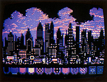 THE WINNER!
John Brooks' City of Lights.
"City of Lights,' by John Brooks of Indianapolis, Indiana, is the top prize winner of ANTIC's first Cover Art Contest (Figure 1). His entry, executed with Paint (Atari), also appears on our cover this month. He receives a $300 cash prize; other winners will receive software.
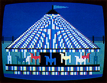 Merry-Go-Round, by Frank Brandle.
Second place goes to Frank Brandle, of Aurora, Colorado, for "Merry-Go-Round,' (Figure 2). Brandle's piece is remarkable for being done in BASIC using Graphics Mode 10. It was also animated so that the horses seem to revolve, but this attractive feature was disregarded by the judges when comparing "Merry-Go-Round" to other entries.
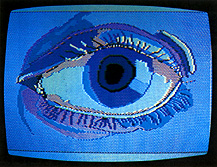 Eye, by Fred Caprilli.
Canadian Fred Caprilli,
of Stoney Creek, Ontario, was our only winner from outside the U.S. His
"Eye" (Figure 3) garnered third place. It was done with Micro-Painter
(DataSoft), and was one of six entries he submitted. About half of our 73
contestants submitted more than one entry, so that a total of 147 entries
were considered.
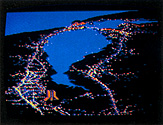 S.F. Bay, by Cecilia.
Three more entries were
awarded Honorable Mention, and are pictured here. "S.F. Bay" (Figure
4), by Cecilia Gaxiola of San Jose, California, impressed us with its accuracy
and texture. Besides, we thought you'd like to see where Atari is located.
Too bad she didn't put the ANTIC "A" in the picture, she might
have won first prize (just kidding).
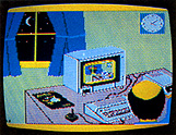 Insomnia, by Richard Slater.
Richard Slater, of
Hubbard, Ohio, caught the spirit of computing, we thought, with his clever
drawing "Insomnia,' (Figure 5). His was narrowly the best of several
entries depicting the ATARI in use. One such near-winner, Jane Zinke, animated
a tiny "monitor" with a dancing chicken, using BASIC A + (OSS).
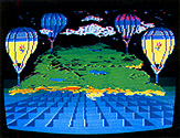 Earth, by Peter Wickman.
Peter Wickman, from San
Francisco, beat the bell by fifteen minutes, delivering his entry by hand
on June 15. Called "Earth,' (Figure 6), it was done using Fun With
Art (Epyx). Seven entries arrived after the contest closed. All were looked
at, but none were considered as finalists--in fairness to those whose work
arrived on time.
One on-time entry was disqualified on a technicality. "Blossoming of Computer Art," by Charles Bennett and Jo Ann Brissenden, was exquisite, but was not "a loadable program." The design was executed on acetate, using Color Print (DataSoft). We will be featuring this would-be entry in a special article in a future ANTIC.
Many entries focussed on space travel, and the Space Shuttle in particular. "Moonwalker," by Marty Bates, "Shuttle,' by Ryan Savko, and "Challenger,' by Thuat Vu, were in strong contention right till the end of the judging. Duane King's "Moon" almost won out as a representative of the few abstract entries.
Names without pictures don't do much good, so we will desist for now. So many good images were submitted that we will continue to show them in upcoming ANTICs, probably in the Microscreens department we began in July. It was delightful to get so many entries; each new package was as exciting as a wrapped gift. We especially thank the youngsters who were outgunned in this competition. We thought it would be impractical to make age a criterion--after all, who's to check? But we did get many entries that were clearly from kids, and we hope to publish some of them soon.
So ends our happy experiment. We found you did enjoy the challenge, and we had fun too. There were clearly enough good entries to grace our cover, yet it was still possible to make judgements about them. Our bias was probably towards "realism" and fineness of execution, because the best of these efforts most demonstrated the powers of the ATARI. The group of finalist stood out, and disagreement among the judges (whose identities may be surmised) were resolved in favor of the design that promised to look best on the cover.
We hope we made the best choice.