Print Shop Power Tricks
Timely tips for your Christmas cards
by JOHN SPIRKO
Master advanced Print Shop techniques not documented with this populare software. Find out how to mix uppercase and lowercase letters, and how to place multiple graphics on the same page. These power hints require Print Shop and Print Shop Companion from Broderbund Software, an 8-bit Atari with minimum 64K memory, disk drive and dot-matrix printer with graphics capability.
Print Shop by Broderbund Software has probably been the most widely used Atari printing program since it was converted from the Apple II in 1985. The later introduction of Print Shop Companion, with its Graphic Editor + , Border Editor and Font Editor, expanded the Print Shop's usefulness even further. But even with these extras, there are still some annoying limitations.
For instance, why can't you have fonts with uppercase and lowercase letters? And aren't there times you'd like to put two or more different graphics on the same page? But there are ways to do these things, as this article will explain.
MAKING ULC FONTS
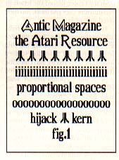
Currently Print Shop doesn't offer a complete upper/lowercase (ULC) font. But we can convert portions of the lowercase font into uppercase letters. Figure 1 has text printed in what appears to be a ULC font. Actually I modified the lowercase font to create only the specific uppercase letters necessary for this text. In this example, I only needed to modify a few letters--M, R and two different A's.
FOR LONGER TEXT
Here's how to modify the the font for the word Antic. Select the Font Editor from Print Shop Companion and load in the lowercase font on side 2. Convert the "a" on the editing screen to uppercase. Your new temporary font is now ready to be saved on disk with a new filename. Then load Print Shop's sign option. (Ignore borders and graphics until you have more experience with this process.) At the font entry screen, load in your temporary font. Type ANTIC on the text entry screen, run on your printer and print your first ULC text.
Simply changing lowercase into uppercase won't work in longer text. Using our previous temporary font, your printer would produce "Antic mAgAzine, the AtAri resource." Making a temparary font for longer text requires extra planning.
Write down your text and mark the uppercase letters. Check for duplicated uppercase letters in the lowercase text. In our example, the M doesn't show up in the lowercase text, so we can replace it with an uppercase M. However, both uppercase and lowercase A's and R's are required. You can replace these letters with unused letters, numbers and punctuation.
For instance, put 1 on the editing screen, clear the screen, and create the uppercase A. Store the uppercase A as 1, the R as 2 and use M instead of m. Note the changes as you create the font. Type "1ntic magazine, the 1tari 2esource." With some font editing and minor character manipulation, your second temporary font is ready to be saved to disk.
Don't limit your font just to letters and numbers. Each unused character can be turned into anything you want. Try including a simple graphic or two. In Figure 1 you'll see two different uppercase A's and an Atari symbol. These were all created with the Font Editor and are part of the font. Electronic symbols, trademarks, astrolog symbols, monograms, etc. can also included in your custom fonts.
The Font Editor's indexing lines, two horizontal lines and one vertical line that appear in editing mode, are guidelines to maintain continuity in designing your font. However, each letter doesn't need to be scrunched up between those lines. For example, M and W often exceed them. In fact, you could cover the entire editing space--and it will be automatically spaced with any adjacent letters when printed.
Kerning is also demonstrated in Figure 1. Look closely at the word "hijack" and you will see that part of the j is actually under the i. Experiment with i, j and other letters to see how it works. Kerning would be impossible without proportional spacing, which, simply put, means you can pack more I's on a line than O's.
LAYOUT GRAPHICS
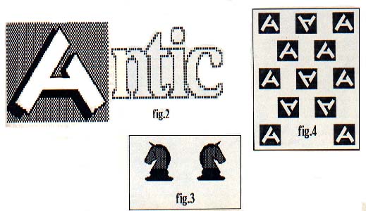
While the Font Editor does well with fancy uppercase letters, consider the Graphic Editor or Graphic Editor + instead. The Graphic Editor, with its larger editing space, allows for greater detail, as shown in the Antic A in Figure 2, a two-page banner printout. This not only provides a unique capital letter but adds another graphic to your collection.
For the banner in Figure 2, I used the Graphic Editor+ to create the Antic A and saved it to disk. Then, using the banner option, I loaded in the standard lowercase font. At the text entry screen I typed just "ntic". Then I loaded the graphic Antic A, positioned it before the text and printed the banner.
Graphics and text are automatically spaced 1-1/2 inches apart in banners, but here's how I managed to avoid this in Figure 2. After the graphic is printed, the printer advances the paper 1 1/2 inches. It then stops briefly before it begins printing the text. As soon as it stops, press [ESCAPE] to pause the printing process. Roll back the paper so the print head is about 1/4-inch below the graphic, then press [RETITRN] to resume printing.
The Layout Guide accompanying this article is a handy reference comparing the graphic sizes and position for Print Shop's flexible sign option, which provides three mixable text modes--solid, outline or 3-D. You have considerable freedom in positioning small or medium graphics with the Custom Layout feature.
COMBINING GRAPHICS
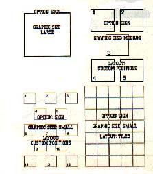
Combining two different graphics on the same page requires several steps. Print Shop signs are normally printed in one pass, but if you make two print passes, you can add a different graphic on the second print pass, as shown in Figure 3. The most important step is setting up the paper in your printer so that each print pass starts at the same location and aligns with the previous pass.
First, load Print Shop and select the sign option. (I again suggest ignoring borders and text until you're experienced with this procedure.) At the graphic entry screen, select your graphic--medium-sized in this case. At the custom layout entry screen, select position one--the top left corner. Tum on your printer and prepare your paper.
Usually you'll have to waste a page. Mark your lead-in page (the page before the one being printed) so that the paper can be returned and exactly realigned for a second pass. The easiest way to do this is with a line across the tear bar (the bar that keeps the paper pressed to the roller).
Next, prepare to print the second graphic. Return the paper to the same position, using the mark on the lead-in page. Insert side 1 of Print Shop and press [RETURN] to go back to the program. Press [ESCAPE] to back to the graphic entry screen. Put your graphics disk in the drive and select your second graphic, using the same size.
At the custom layout entry screen, delete graphic position one (still in memory) and select position two (top right). Then print the second graphic. If you've aligned the paper correctly, the graphics should be positioned side by side at the top of the page.
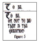
Figure 4 is a similar example of multiple print passes, this time with small graphics. Here, the Antic A was combined with an inverted A. Load Print Shop, select sign, go to the graphics entry screen and select a (from the Layout Guide) to avoid overprinting on the second pass.
In Figure 4, the first print pass positions (1, 2, 4, 6, 8, 9, 11 and 13) were chosen from the custom layout entry screen (small graphic) and the sign was printed. Return the paper to the original print position. Insert side 1, return to the graphic entry screen and select the second graphic.
Notice that the program has kept your parameters in memory and it's easy to cycle backwards through the program. At the custom layout entry screen, delete the first print pass positions and enter the second positions (2, 5, 7, 10 and 12, in this case). Print, and you have your mixed graphics.
When adding a border and/or text on the first print pass, don't forget to back up to the border and text entry screens and delete them. Otherwise any misalignment of paper will likely produce unwanted effects on the second print pass.
With some planning (and patience), you could put as many as 13 small or five medium graphics on a single page. Other unusual effects can be achieved by using a different font for each print pass.
in Figure 3, mirrored graphics were created with the Graphic Editor +. While in the Graphic Editor, load a graphic and save it to another disk, but denote it as (L)eft or (R)ight. Then on the graphic editing screen, flip the graphic horizontally and save it as the opposite version. You can also use a regular graphic along with an inverse (negative) instead of paired left and right graphics.
GRAPHICS AND FONTS
Figure 5 shows an uppercase letter followed by text. While this is similar to the banner in Figure 2, it's harder to do. You've probably placed a graphic or two, typed in some text, and bang--a collision, right?
Combining a graphic with a font is just as tricky. I only do this in the sign mode, since it requires several practice runs to line up the graphic with the font. (See Figure 5.) When you mix text and graphics on the same page, you have only a rough idea where to start the text. Sometimes this problem is complicated by proportional spacing.
Trying to align a graphic with text requires going through the program several times. The results can be gratifying, particularly when you want something special or if you're making a master copy for photocopying. I always use position 1 from the custom layout entry screen, usually with a small graphic. But it also works with a medium graphic.
At the text entry screen, type in the first two lines of text and print them to see how well they match the graphic. Then press [RETURN] to reenter the program and insert side 1. Press [ESCAPE] to return to the text screen and make the necessary adjustments in the text.
Using the second line of text as a guide, adjust the first line of text. Use spaces to move the text towards the left and nearer to the graphic. If the text overruns the graphic, you will have to erase the line and start over. Then do a second trial printout and, if necessary, repeat the procedure until the text and graphic are brought together. Once you're satisfied, return to the text screen and complete the rest of the text.
Mixing text with a large graphic might produce "busy," unreadable results. Instead of printing the text and graphic together, I take an old, faded ribbon (or a colored ribbon) and print the graphic on the first pass. Then I switch ribbons and print the text on the second print pass. This works well with cartridge-type ribbons--the text stands out and doesn't compete with the graphic.
You'll get the best results with 15-pound or 20-pound paper. Making multiple passes on lightweight paper is possible, but much harder to bring off. Tractor feed is a must, unless your printer only uses single sheets.
PRINT SHOP SERIES
Broderbund Software
17 Paul Drive
San Rafael, CA 94903
(415) 492-3200
Print Shop--$44.95, 48K disk
Print Shop Companion--$34.95,
64K disk
Print Shop Library 1,2 and 3-
$24.95 each, 64K disk
CIRCLE 163 ON READER SERVICE CARD
John Spirko is an import specialist for an aerospace company in Fort Erie, Ontario, Canada. This is his first publication in Antic.
TYPESETTER ($34.95)
PAGE DESIGNER ($29.95)
RUBBER STAMP ($29.95)
P.S. INTERFACE ($29.95)
XLEnt Software
P.O. Box 5228
Springfield, VA 22150
(703) 644-8881
CIRCLE 160 ON READER SERVICE CARD
XLEnt's popular printing software series gives 8-bit Atari users another choice of tools for mixing graphics and text elements on a page. These flexible and powerful page layout package that combines much of the best of Print Shop and Newsroom. Many features, in turn, means many commands to master. XLEnt's new P.S. Interface converts Print Shop icons for use with Typesetter.